
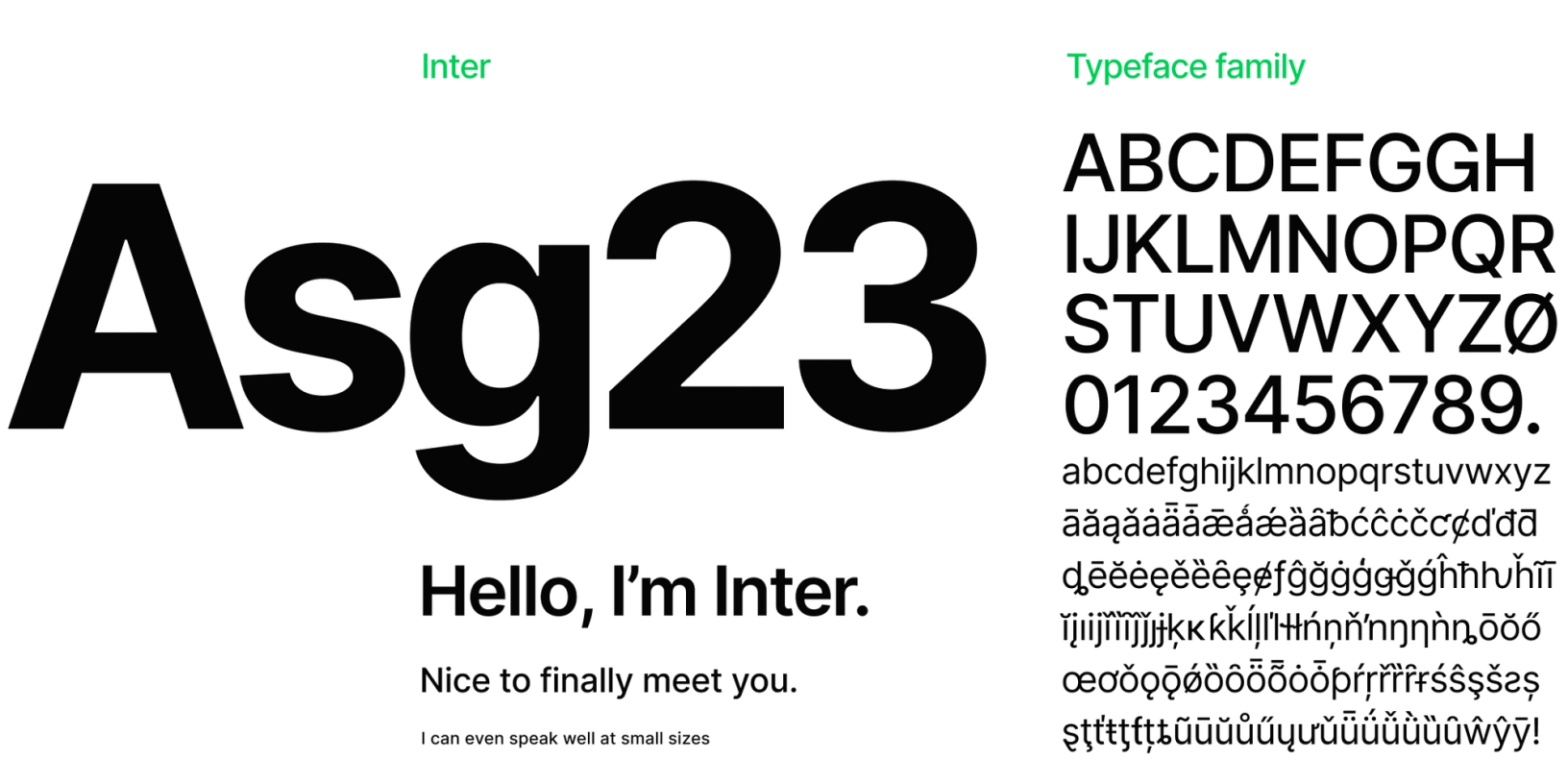
The birth of Inter: How the new open-source typeface used by GitHub and Mozilla came to be


It takes a lot of work to invent a typeface. Figma designer Rasmus Andersson learned that first hand while creating Inter — a font meant to make it easier to read text on computer screens.
Rasmus Andersson came up with the idea for Inter in his work on Figma. We'd used Roboto (designed by Christian Robertson for Google) as our main font for years, and we were running up against its limitations. It was originally built to work as both a display typeface (for things like titles) and text typeface (for longer blocks like paragraphs). But it was difficult to read Roboto when it was small (small text makes up much of the typography in Figma's UI).
Rasmus and the design team did a month-long research project to find a better-suiting option, but Roboto still came out on top and we stuck with it for several years.
This experience got Rasmus thinking about text-heavy UIs and typefaces. He decided to try making his own font, designed solely for computer user interfaces, and offer it for free to the world. He released the first set of glyphs for Inter in August 2017, and he's been iterating on it continuously ever since.
We sat down with Rasmus to get more back story on Inter and find out what goes into creating a brand new typeface.

How much experience did you have with creating typefaces before Inter?

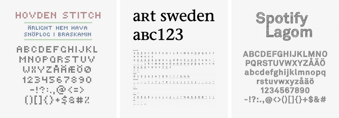
Very little. I'd never made a text typeface before. I'd made a couple of hobby typefaces in my own time and a few display typefaces at Spotify. [Editor's note: Rasmus was the first designer at Spotify in 2006]. But none of those were close to the scale of this project.
When I started this, I didn't understand how much work it was going to be. If I wanted to do it properly, I figured it was probably going to take a year or something like that.
It turns out it's probably more of a five, 10 year project to do it fully.

How long did it take you to get to the core set of glyphs?
How do you define 'core set of glyphs'? There are more than 150 different written scripts in the world—at least those that are well-recognized. Only a small portion of them are Latin-based, like what English is. Where capital A looks like A and stuff like that.
Then, there's the Greek alphabet which is similar to Latin as well as Cyrillic. Then we have Arabic and Hangul which are very different from Latin typography. Spacing is different, capital letters, lowercase letters, there are so many differences in the fundamental design of things.
You can probably spend a human lifetime making one typeface family encompassing all of these scripts.
Where did you decide to start?
Because I'm a Latin script kind of person (it's what I'm familiar with), I focused on that. Within the first year, before making it open source, I had something that covered the 200 most common Latin characters.
What did you do for everything else?
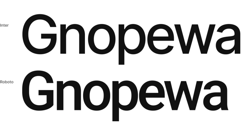
I back-filled glyphs from Roboto. The Cyrillic characters and a lot of the Greek characters came from Roboto for a long time. The typeface is dual licensed for this reason. I didn't anticipate this being so effective, but I found it was a great way to get started. As the project moved on, I recreated these glyphs one by one to fit into the Inter style.
What worked well backfilling from Roboto?
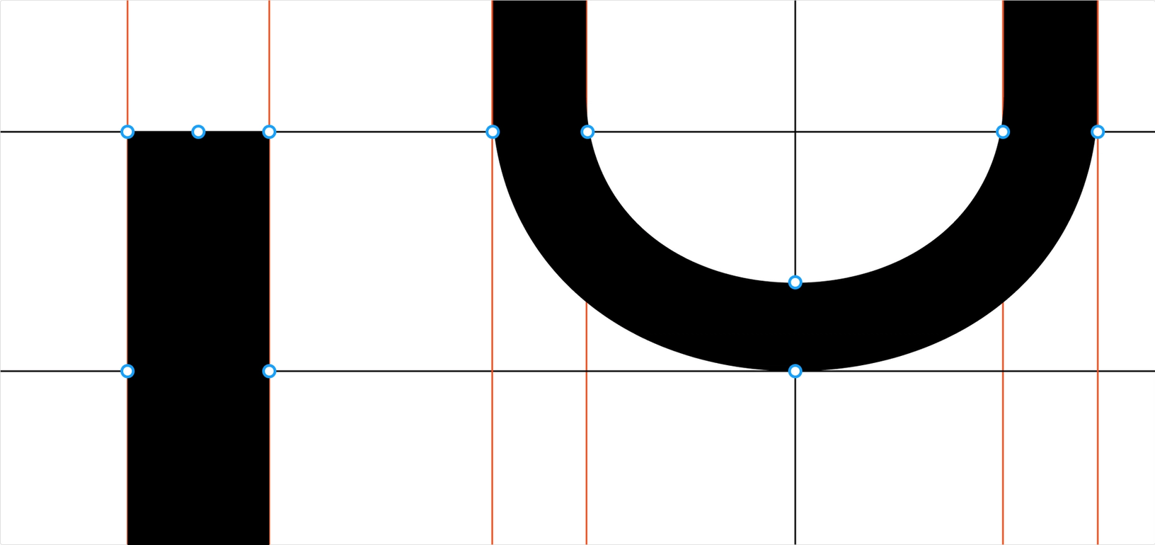
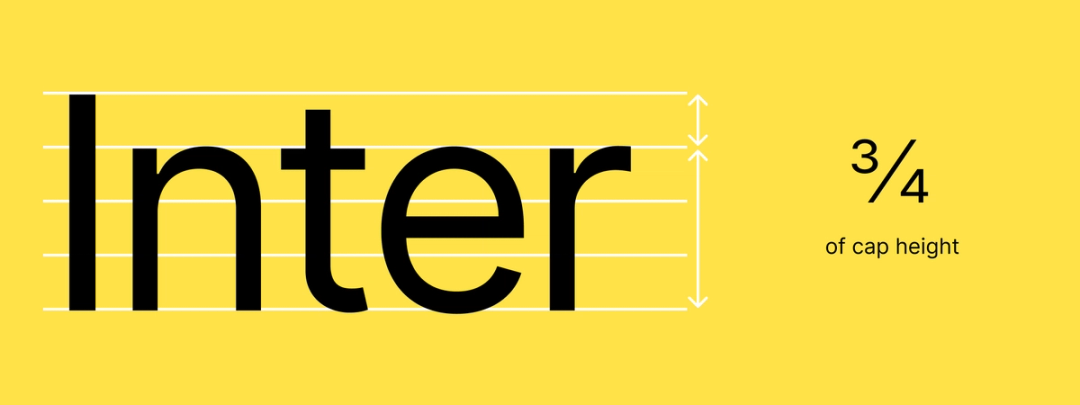
One thing that I did find really nice about Roboto is its x-height-to-cap-height proportion—the scale or size difference between capital letters and lowercase characters.

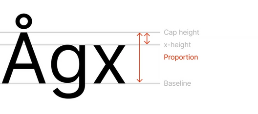
If you take the lower case “x” and capital “X" and you measure the distance between the top of the two, you find that the proportion compared to the height of the lower case “x” varies a lot between different typefaces.

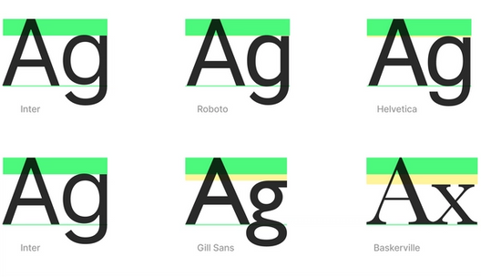
Roboto has a nice proportion between lowercase and capital characters, similar to some other grotesque typefaces like Apple's San Francisco, Akkurat, Graphik, Aeonik, Helvetica and many others. There's a...it's neoclassical, I don't know, it's become...classical in the sense of a lot of things are doing it because it just works. I think it worked.

What didn't work well with the Roboto backfilled characters?
Roboto is more condensed. It's squeezed together a little bit on the X axis. That was a challenge to work around, given a backfill of some Cyrillic and Greek characters, like Omega, for instance.

Part of this project seems to be knowing when to cut your losses and accept what's there, versus recreate from scratch.
I have very little anxiety about it and almost no stress. I can come home after a long day and I can spend 15 minutes making a small improvement to, for instance, a glyph. I can spend a whole weekend of focus time just crunching it. Sometimes I spend an hour early in the morning before going to work.
You can make little notes for tomorrow or maybe the next time you have some time to sit down. You can say, "Where the bend of the 'n' comes down into its vertical stem there, it's a little too fat when it's viewed at this size, or when it's set in low contrast."
Then the following day or the following week or something like that, you finally have a little bit of time, you look at your notes...and then you fix the bend in the 'n', right? For me, it's been a very casual iterative process like that. There's this never-ending stream of fun little things to do.
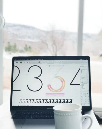
When I’m traveling for vacation, I often find some time in between adventures to work on something. Here are two photos from a trip to Zion National Park earlier this year, working on the “thin” weights of Inter which came later on in the project’s life:


I like to get up early, brew some coffee and get some good fun work in before the day starts.
That sounds meditative, like flow work. You can zoom into the micro and lose yourself in it.
A lot of this meditative work is making adjustments to things.
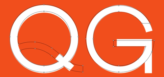
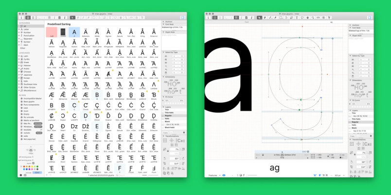
There is a difference in what details you focus on with making a display typeface versus a text typeface. With a text typeface, you spend most of the time on spacing, pacing, stem thickness and stuff like that, much, much more so than on designing the actual glyphs. You also spend a lot of time on how the characters relate to one another.
With display type, you usually spend much more time taking care of shaping curves and making the glyphs feel really spot on. Thickness, positioning, stem angles. Details that affect rasterization. Things like that.
It also sounds like you could go crazy because you could tweak for infinity. You tweak one thing and it interrupts the rhythm with something else.
I spent almost three years on this project, and I feel it like I could easily spend three more years. Almost every week I do something on it, even if it's just 5 minutes replying to a question somewhere.
Who asks you questions about Inter?
People around the world. I get a lot of emails, tweets, questions about it and stuff like that. There's always feedback—on how people are using it, what is missing, what could be better.
For instance, I have redrawn, not all of them, but quite a few of the Cyrillic characters. I'm not a native Cyrillic script person, so I feel that I am struggling a bit with that.
Someone from Russia found an issue and said, "This particular glyph, it looks totally wrong to me. I'm not used to seeing that." I asked, "What is the recipe for making it right?" And he's like, "I don't really know, but that doesn't look right."
Typography has a lot of these interesting situations in it where a lot of the characters that we're used to seeing have no definitive shape. A capital T is usually two rectangles together. Right? But, what about a lowercase a? What about an S? There's not one S that's identical to another S in a typeface. There are practically infinite variations on these shapes.


What tools did you use to design Inter?
I started out with RoboFont which is this commercial software. It is a foundation that you expand with plugins, so in order to draw a rectangle in RoboFont, you need a rectangle plugin. It's a programming-forward platform where you do a lot of work by writing Python scripts.
For probably historical reasons, or maybe because of the Van Rossum brothers, most—if not all—tooling for typography is Python. There are exceptions, but all of the major font editors, they all provide plugin systems and scripting with Python. So, Python it is.
You think that's just because someone that was an earlier pioneer in creating typefaces on computers loved Python?
Exactly. No, yeah, there's nothing inherent about Python that makes it good or bad for typography, whatever.
A little over a year ago I switched over to Glyphs, which is one of the other popular commercial applications. Again, it also has a plugin system based on Python. It offers great performance and one of the creators, Georg Seifert, seems to be a very nice person. He's been very responsive in terms of replying to my questions and sending beta builds to address an issue right away, which I think is incredible for being a two-person shop.

What do you need specifically in typography designing software that you couldn't get in Illustrator or something?
A lot of the work that goes into typography is not about drawing, at least with a text-oriented typeface. Instead, it's about mechanics, spacing and metadata—the variety of metrics that exist in a typeface which influence how text appears. So there's some percentage of drawing glyphs and then the rest is a lot of programming, kerning and making many small adjustments while constantly testing the font against various text samples.
There's a lot of composition involved, so components is a very common workflow. In these font tools, you say: "This thing with the dots over it composes the A and the dots glyphs." Now, in the future when I make an adjustment to my A, it adjusts all of those characters that are based on A automatically. You can create these very efficient ways of iterating on the design through use of components.
It's like Figma components, basically.
It is, it works very similarly to Figma components, actually. Things like components and kerning assistance are the primary upsides of these font-specific design tools.
What's the story on how Inter became the UI font in Figma? Was that always the plan?
No. When I started the project, there was a hope that if it was successful it could be used in Figma, but it was not the plan. It took quite a while for our design team to consider it.
Why did it take a while?
Since I personally work at Figma and Inter is my side project—maybe this is a weird Swedish thing, but—I felt that I couldn't really propose Inter to be used in Figma at all. I hoped that it could be useful, but I didn't have much expectation and I certainly didn't push on it.
In late 2018, we had a project to do a redesign of our UI From typography and layout to color and iconography, you’ll notice a lot of subtle differences throughout the tool.
We refreshed Figma's UI: An inside look at our process
What worked well about it?
A lot of the Figma UI is typography based. We organize information in the UI largely through spacing and typography, and we use text for elements that you might rarely interact with, like menus, or things that are particularly important concepts to understand, like the layers/asset panel labels.

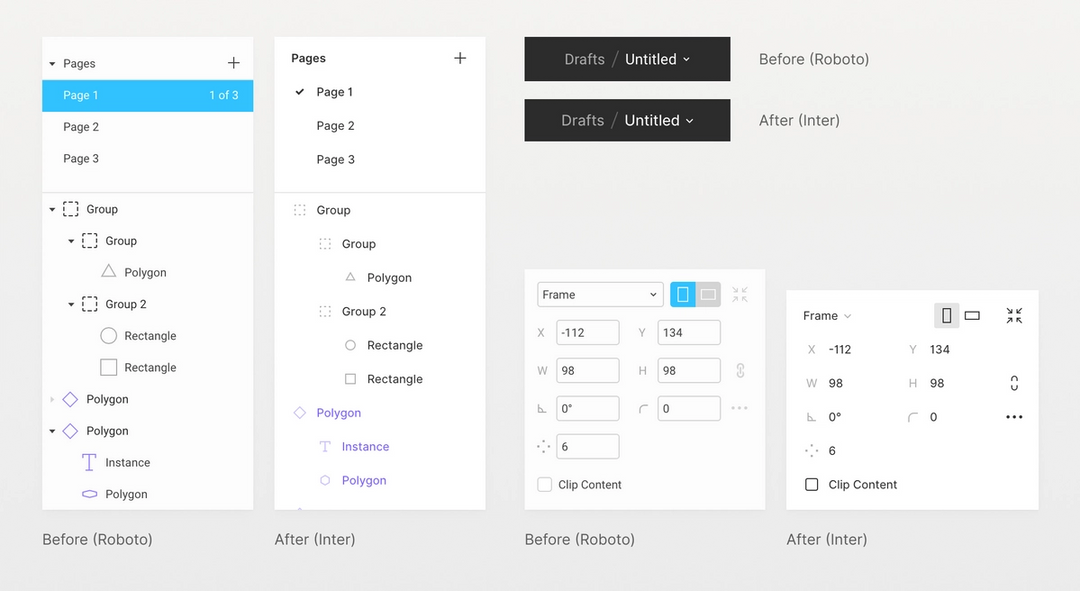
We found Inter to be easier to read in our UI than the alternatives. Some numbers were sharper, some characters like the "degree" sign, percentage sign and so on.
Are you creating custom Inter glyphs just for Figma?
I have not done that. In the future, I think there's a possibility of Figma just forking Inter and making its own changes. Right? This is one of the great upsides of open source. It's not actually that hard.
What's been the most exciting adoption to see of Inter?
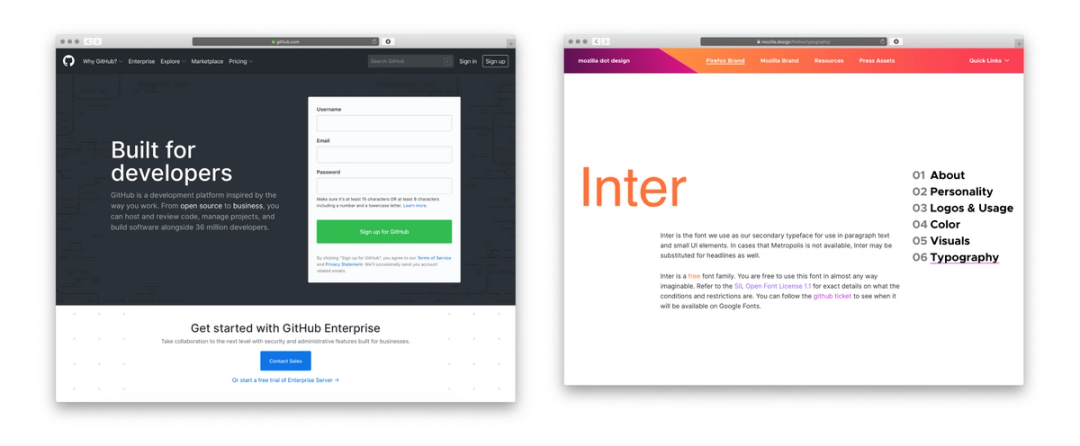
GitHub and Mozilla are pretty big names. That’s really exciting. There was a Japanese agency that used it for some kind of really large display, like the second biggest square in Tokyo. It was so random. Really cool.
How did you find out about it? Did they tell you? Did somebody take a photo?
Yeah, they contacted me. I really wish people would do this more. If you read this and use Inter for something cool, I would like to hear about it.
Is that the only way you find out how Inter is being used? People have to tell you?
With other kinds of software applications, there's so much infrastructure around analytics and download count and stuff like that, and feedback loops.
With a typeface, it's just this black box as to who is using some of the stuff, then you have no way of reaching back. You're completely reliant on whoever makes use of it tells you about it, which probably no one does, right?
It's like, if you download an app on the app store and you open it, you're not going to email the creator and say, “Hey, I used your app,” right?
Same is true of typefaces. It's had ... I don't know how many people have downloaded it yet. I do have a counter. It's 100 thousand or so people have downloaded it, or at least 100 thousand, and I have no idea what that means. That means at least a few thousand are using it. Ha, ha.
Right.
Probably more than that.
And how many people have actually told you they're using it?
I've heard of maybe 100.

I think I told you that Andrea [our co-worker] was giving a presentation on content strategy and I was like, “Oh, what's that font, I really like it?” And she was like, “It's Inter.”
There's a lot of that. GitHub started using it maybe a year ago or something like that, it was pretty early on, actually, and I was really surprised. One day someone was just like, "Hey, have you seen this?" And I went to GitHub and I saw Inter everywhere at GitHub. I was just like, "Okay, that's cool. I had no idea.” Same thing with Mozilla when they made Inter a part of their brand refresh.
Do you know how they found out about it?
No.
That's so funny.
I don't know. I haven't done any marketing at all around this. Haven't spent any money except my own time and the money invested in software that I bought.
Sometimes I'll hear about something from somebody that's been using it for a while. I'm like, "Wait, what? I had no idea, that's really cool."