Rebecca Quintana, Learning Experience Designer
@rebquintana
“Visual representations can render phenomena, relationships, and ideas visible, allowing patterns to emerge from apparent disorder to become detectable and available to our senses and intellect.” (Hansen, 2000, p. 198)
A well-known challenge for design teams is being able to get a sense of the “big picture” of a design without a mediational tool or aid (Arias et al., 1997). In the field of learning design, diagrammatic or iconic representations of curriculum design can be valuable because they can highlight the relationships among learning activities, to give the viewer a sense of flow and movement (Quintana et al., 2018). Researchers of Massive Open Online Courses (MOOCs) have just recently begun to make initial forays into creating design representations of MOOC curricula. For instance, Daniel Seaton and his colleagues at Harvard have developed methods that enable the creation of iconic representations of course elements (e.g., videos, textual readings) to promote understanding of relationships among course elements (see Seaton, 2016). Seaton’s methods and approach have inspired much of the work I describe in this blog post.
In Part 1 of this two-part series, I described how we use curriculum storyboards during the early stages of the design process to represent emerging ideas about curriculum design and to give project team members a sense of the curriculum sequence—including its rhythm and cadence. In this blog post, I will share our work in the academic research and development space at the Office of Academic Innovation, and describe our experimentation with two representational formats to understand their potential utility for enabling curriculum designers to understand and reflect on course structure once a course has been designed and has “launched.” I will detail our investigation of the following two design representations: (1) course composition diagrams, which are digital and interactive representations of curriculum design, and (2) beaded representations of course structure, which are tangible constructions made with traditional craft materials, such as beads and straws. Both of these representational formats portray an abstraction of course elements and sequences, and fall under the designation of design representations—the codification of a curriculum design that makes it available for review and critique. The goal of our investigations was twofold: (1) to understand the kinds of insights that could be elicited by each format, and (2) the potential value of eliciting insights among design team members at the conclusion of a design process.
Course composition diagrams
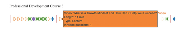
Following the methods described by Seaton (2016), we used Plot.ly, a web-based tool for creating infographics, to visualize the course structure of ten recently launched MOOCs on the Coursera platform. Yuanru Tan, a Learning Design and Accessibility Student fellow at Academic Innovation, manually “scraped” data from each page of each course (e.g., video titles, video length, number of “in-video” questions in a video) and from Coursera’s administrative analytics pages (e.g., average quiz scores) as the basis for the course composition diagrams. We used abstract icons to represent the elements of each course (e.g., videos were represented by orange triangles), displaying them in chronological order. Two examples are shown in Figure 1 (course names have been anonymized).
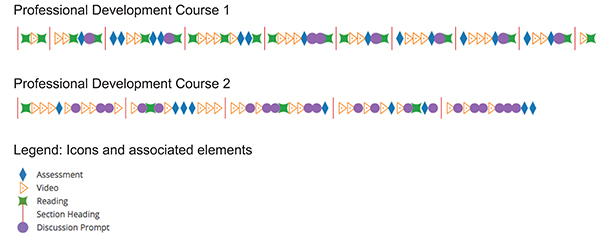
The visualization elements were interactive; as users “hovered” over an element, they could obtain more details about it, such as title (for a video) and average quiz score (for a quiz). See Figure 2.
We invited members of the ten design teams who had worked on these courses, including faculty members, design managers, learning experience designers, course development assistants, course advocates, media specialists, and marketing specialists, to interact with one or more course composition diagrams (i.e., for courses that they worked on) and to complete a short survey that asked them to comment on their experience of interacting with the representation.
Yuanru Tan and I qualitatively analyzed the survey data, following an iterative process outlined by Creswell (2015). Our analysis of the survey data revealed several themes, however in this blog post, I will focus on only one—aspects of the affordances of course composition diagrams. Design team members described how the representations provided a high-level overview of course structure which revealed the proportion of one element type to another. The language in the responses to our survey echoed the principles of visual design, such as balance, variety, repetition, pattern, rhythm, emphasis, and movement. For instance, some comments related to balance with respect to the distribution of one or more element type. One respondent remarked, “Each module was relatively ‘even’ in terms of the number of content types.” Other comments related to balance with respect to the weighting or preponderance of an element type within a specific part of the course: “I see a similar trend of very heavy reading modules in the middle/end of the course.” Our analysis showed that the course composition diagrams allowed design team members to see “what was there,” from an objective point of view, while enabling them to see the relationship of individual elements to the whole course “composition,” suggesting that design team members were able to understand the course structure in a nuanced way.
Beaded representations of course structure
In a second study, we explored an unconventional format—that of beaded representations—to represent the five MOOCs that are part of the School of Education MicroMasters program, offered on the edX platform. Noni Korf, Director of the Learning Design and Media Team, envisioned the idea while at the edX Partners conference in Paris. Noni said, “While in Paris, I found some striped beads that reminded me of icons for text documents, which inspired the first beaded representation.” She was interested in seeing if the differences between the Coursera and edX platforms might be revealed through the beaded representations: “I was interested in finding patterns in MOOCs—were there ways of describing our course experiences that didn’t involve us diving deeply into the content? Could MOOCs be categorized as molecules with different molecular weights? Or pie chart bubbles with differing ratios of content with which to interact? Looking across our portfolio, I wanted to see if patterns would emerge in courses that followed a strictly linear structure (i.e., our MOOCs on Coursera) and in courses that offer more flexibility for learners (i.e., our MOOCs on edX).”
Our learning experience design team developed a method for representing course structure using traditional craft materials (e.g., transparent, translucent, and opaque beads, and colorful drinking straws), stringing them together in chronological order. Each course element corresponded to a “type” of material (e.g., readings were depicted using striped, opaque beads). Because the edX interface uses a nested structure, with course elements organized in sections and subsections, we depicted each subsection as an individual beaded string. Participants could comprehend the hierarchical structure of the course by viewing the first string of beads, followed by the next string beneath it. The courses we depicted were not entirely linear, and where learners could make choices about where to proceed next, so we created a branching structure in the representation by crimping shorter lengths of strings and attaching them to the stem (see Figure 3).
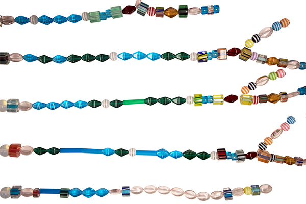
Figure 3: The hierarchical structure of a section of a course is evident through the beaded representation. Each string depicts a subunit (an activity sequence that could include elements such as short and long videos, discussion forums, teamwork, and assessments).
We invited members of the design team that developed the MicroMasters series, including Dr. Don Peurach, the lead designer and course instructor, and Kathryn Gabriele, a graduate student (co-designer) to participate in a focus group session to view and interact with the beaded representations. Our conversation centered around the insights gleaned through viewing the beaded representations. Following a methodology that was similar to the first study, we analyzed transcripts from the discussion. Four uses for the beaded representations were evident from our analysis of the discussion: (1) participants were able to make curricular connections related to course architecture and pedagogical approaches, (2) participants were able to come to a deeper understanding of the learner experience, (3) participants gained insights about the design process, and (4) participants reflected on the method.
As with our prior work with course composition diagrams, the beaded representations provided a “bird’s-eye view” of course structure, allowed participants to make connections among elements, and enabled them to notice aspects such as pattern and variety. We noted the beaded representations acted as “boundary objects,” allowing participants to externalize ideas, facilitate shared understanding, and bridge conceptual gaps (Arias et al., 1997). Our use of traditional craft materials was intended to introduce an element of playfulness and intrigue into our participants’ experience. One participant remarked on how he had a “visceral” reaction to the beaded representations: “What the beads are doing is driving me to think and rethink.”
Future work
We intend to deepen our research around design representations, as we continue to refine our methods. Future work will include creating cluster visualizations of courses that are similar along particular dimensions, such as by content type, sequencing, and other types of patterns. We will continue to involve design teams in our work, asking them for their insight toward understanding the utility of various design representations to support understanding and reflection on design at various stages of the design process.
We look forward to receiving feedback on this work at the American Educational Researchers Association (AERA) conference and at the Conference for Human Computer Interaction (CHI). This will help us to advance our work on design representations as part of the work of academic research and development that is happening at Academic Innovation.
Rebecca Quintana, Yuanru Tan, and Noni Korf will present their paper “Visualizing course structure: Using course composition diagrams to reflect on design” at the 2018 Annual Meeting of the American Educational Research Association (AERA) in New York where it has been awarded “Best Paper” in the Online Teaching and Learning Special Interest Group.
Rebecca Quintana and Kathryn Gabriele will present the work of their co-authors Yuanru Tan and Noni Korf at the 2018 CHI conference: “‘It’s just that visceral’: Eliciting design insight using beaded representations of online course structure.”
Selected references
- Arias, E., Eden, H., & Fisher, G. (1997, August). Enhancing communication, facilitating shared understanding, and creating better artifacts by integrating physical and computational media for design. In Proceedings of the 2nd conference on Designing interactive systems: processes, practices, methods, and techniques (pp. 1-12). ACM.
- Creswell, J. W. (2015). Educational research: Planning, conducting, and evaluating quantitative and qualitative research. Boston: Pearson.
- Hansen, Y. M. (2000). Visualization for thinking, planning, and problem solving (pp. 193-220). Cambridge, MA: MIT Press.
- Quintana, R., Tan, Y., & Korf, N. (2018, April). Visualizing course structure: Using course composition diagrams to reflect on design. Paper to be presented at the Annual Meeting of the American Educational Research Association (AERA). April 13-17. New York, New York.
- Seaton, D. (2016, January 29). Exploring Course Structure at HarvardX: A New Year’s Resolution for MOOC Research [blogpost]. Retrieved from https://vpal.harvard.edu/blog/exploring-course-structure-harvardx-new-year’s-resolution-mooc-research