Sketching A New Identity For U.S. Soccer
For years, the U.S. National Team has struggled to figure out exactly what it is. Perhaps some conceptual creativity can help.
Every few months, a thought pops into my head:
“I should revisit the U.S. stuff.”
It’s not that I don’t love the ideas I laid out three years ago in the USA Kit series. It’s not that some of the design work wasn’t headed down the right track. And it’s not that U.S. Soccer’s visual identity has been misguided in the meantime.
It’s just that everything — you, me, American soccer culture — has changed significantly since. And those changes necessarily mean I have more to say on the subject.
One thing I didn’t do in that first series was try and redesign the team’s graphic mark. I played with colors and uniform ideas, but left the familiar U.S. Soccer crest in place. I think I understood that it wasn’t the right time — for me, as a fan or as a designer — to attempt any changes on that front. Sure, I had ideas, but back then, it just seemed a step too far.
It’s time to revisit. If rumors hold, U.S. Soccer looks set to reveal a new visual identity soon. In my world, that’s a big deal — something about which I have many opinions, and to which I long to contribute.
Ergo, this piece, which I see as a current comment on the national program’s visual identity and brand. To me, it’s less about uniforms or style choices, and more about building something iconic and beautiful that can envelop, extend, and amplify the passion that more and more Americans are bringing to the game.
Yes, I’ve worked up a new crest mark. But that’s not the full scope of what I’d like to discuss. As I have in pieces on various soccer identities, I’ve been thinking about U.S. Soccer’s graphic identity as larger than a crest or a logo or a shield. I envision a redesign as a chance to introduce a modular system — one that can be mapped to the many different ways Americans are finding to be fans.
The new U.S. Soccer system I’ve worked up is not fully complete, by design; indeed it’s meant to be a framework that evolves over time. Hopefully I’ve developed it enough to allow the reader to mull over their own interpretations of this hypothetical U.S. Soccer brand. Unlike the “USA Kit” series, I’ll be concentrating on the team’s graphic identity, not specifically the uniforms.
The Need for Change
The general thrust of the new idea was “something dynamic breaking out of an inner circle.” I wasn’t sure what, exactly. I made a lot of sketches that looked like this:

Hmm…
Like many things U.S. Soccer, the team’s graphic identity has seemed eternally stuck between worlds, stalled at a crossroads of cultures, eras, and tastes. The shield, which dates to the 1990s, and the overall brand, which goes back to the ‘80s or so, carries over much from those earlier days. We’ve always tolerated it; now that it’s imbued with the excitement and stature of notable success, the shield actually carries some sentimental value for U.S. Soccer fans. But it must, and will, change.
Why?
- It’s visually stale, confusing and inelegant.
- Alternative designs, including retro styles, have proven very popular with fans.
- A new design moves product and gets people excited.
- It’s just a crest. What’s needed now is a system.
Solving for everything on the list above, and having the solution be (for lack of a better word) cool, always seemed out of reach to me.
Challenges, Guidelines, Inspirations
But imagine if you could solve the equation. Imagine if a new U.S. Soccer graphic identity was:
- Fresh, simple, straightforward and refined.
- Created with a nod to American soccer heritage, the present, and the future.
- An exciting design idea suited to team uniforms, casual apparel and much more.
- The foundation of a well-constructed system that let the brand grow in limitless directions.
- Cool.
What guidelines, if any, should one follow to arrive there?
I’ve been thinking about these points while sketching out U.S. Soccer logos for years now. (It’s one of my favorite hobbies; for better or worse, I have notebooks filled with sketch concepts.) Every time I start a new idea, I test it against these principles.
The right design has to navigates choppy waters. It shouldn’t be overly retro, or overly modern. It must, in fact, avoid being heavily swayed by any common “school” of sports identity design. (To name a few: novelty, heraldic complexity, pure minimalism, mundanity.) It would have to be visually rich enough to act as a crest, but simple enough to doodle in the margin of a notebook while daydreaming in class. (This is how designers are made.) It would have to convey feelings of both American-ness and soccer culture, without feeling too derivative or clip-arty. It shouldn’t pander to jingoistic patriotism (on the one hand) or continental fútbol snobbery (on the other).
Moreover, its usage would have to seem appropriate for official, organizational capacities, while at the same time feeling comfortable in casual, unofficial settings (for instance, by supporters’ groups). It would have to portray strength, but not arrogance; determination, but not overt aggression. And it couldn’t be a generic; it would need personality.
Easy, right? Next, to find inspiration. Out of what might have been a list of hundreds of influences, I narrowed my focus to several:
- Prominent, powerful marks in global soccer
- Official U.S. insignia
- U.S. Soccer’s visual history, and related national logos
From those categories, I used influential designs I’ve always loved. Here’s where I ended up:
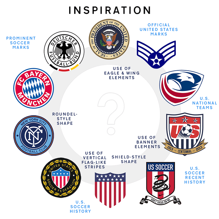
Patterns started to emerge, along with various recurring shapes: stripes, eagles, banners. I was getting closer. Now there were new questions to answer: How many colors? How many elements? What kind of typography? But before I could get to them, there was one fundamental question I had to answer.
What shape should the mark be?
Guidelines and influences pointed to both round shapes and shield-style crests as equally valid. Many great soccer logos are circular; the roundel (a logo made up of an inner circle surrounded by a contrasting ring which often contains text) has a well-established place in global soccer identity, and athletic design in general. The roundel also has a home in official “American” capacities; look no further than the Presidential Seal for a fine example. And as recently as the 1980s, U.S. Soccer used one.
Shields, however, are equally (if not more) important in soccer design language. The heraldic roots of soccer identity are still expressed in a variety of shield-style shapes. And of course that’s what U.S. Soccer uses now.
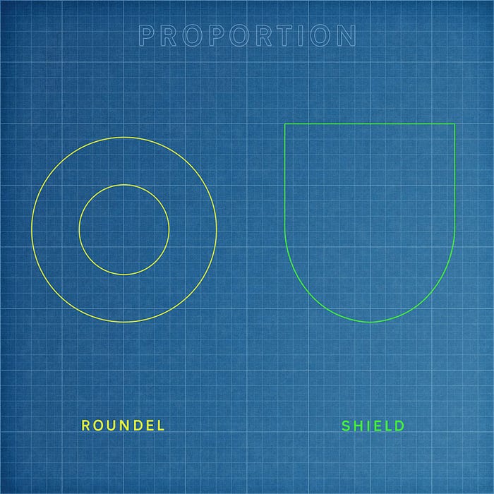
It was the defining question. So, I kept sketching. One day, I hit on an idea.
The Mark
It began, as many of my U.S. Soccer crest ideas have, with the circle (or a ball, if you like) as a foundational element. I’d been playing around with incorporating eagle iconography, and decided to add outstretched wings to the ball as that “breakaway” element. At first, that produced a very horizontal mark, somewhat akin to the Bentley logo. That’s not ideal for a soccer crest that often needs to fit into vertically-aligned spaces. But I was on to something. After working on that germ of an idea for a good while, I think I have something that can answer the challenges I set up.
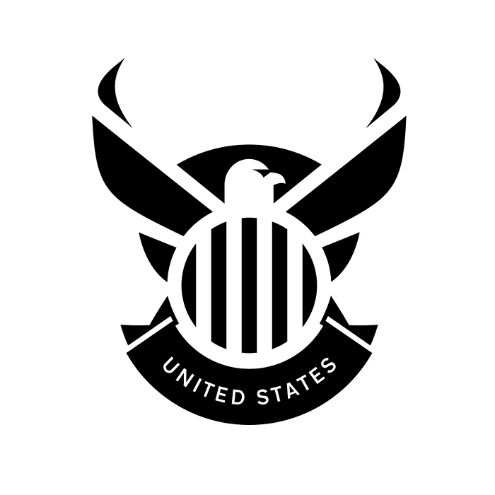
Meet my take on the U.S. Soccer crest, and the first step on the path to an identity system for American soccer.

What I like about this: It’s energetic. It’s intriguing. It’s really American, but not crass. It’s avoids being too silly, basic, fussy, euro, clever or xxxxxtreme. It’s something I think domestic soccer fans could grow with.
Take another look at how I got here:
The key was bringing the wings up. As the wings are elevated, not only do they look more glorious, but the mark’s shape begins to become shield-like, without losing its pleasing round proportion. This was a eureka moment. The mark could have elements of each definitive crest shape, roundel and shield. The trick was to execute the design in a way that didn’t seem to overly complicated, or weighed down by the roundel/shield idea.
It took some time, but I think I arrived at something harmonious.
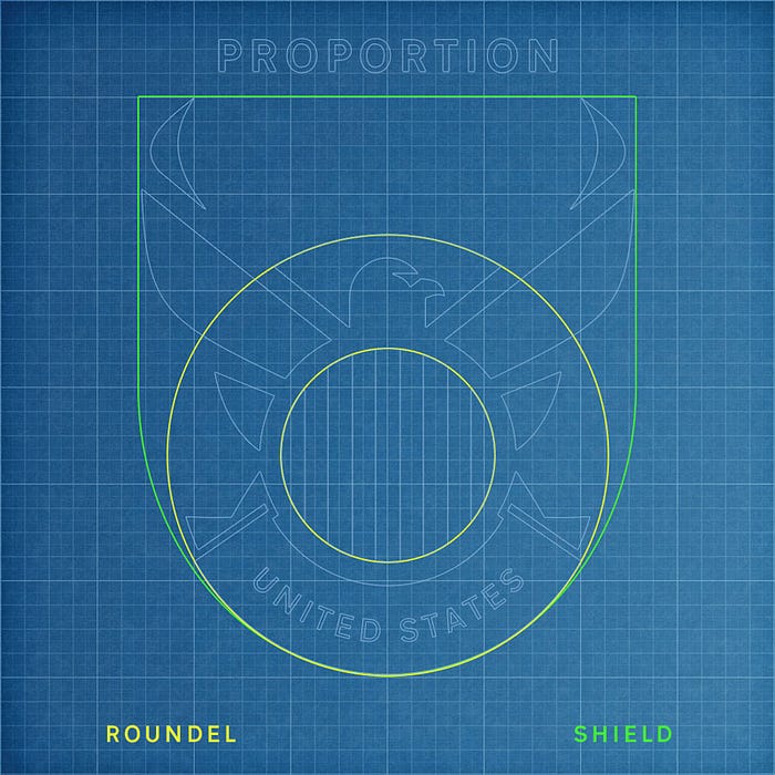
With the roundel shape as a foundation, the mark achieves both a sense of satisfying balance, and a home in the world of soccer crest design. And with the lightest additional suggestion of a shield-based shape, the mark plays homage to important global and domestic soccer history.
Let’s talk about the eagle. Like some of the influences above, the mark features our most enduring patriotic symbol, the North American (bald) eagle. As symbols go, it doesn’t get too much more American than that (unless you portray one, say, devouring an apple pie while being ridden by Abe Lincoln). In this mark, the eagle is shown with wings spread in a state of glorious victory, or a show of strength. In spreading its wings so, the bird breaks through the circular form and creates a shape that feels dynamic and crest-like. The rendering here is simple and basic, reducing the eagle design to familiar shapes, but it retains the power of a detailed, “old school” heraldic crest.
Next, stripes. Many U.S. marks use vertical red and white stripes to echo the flag. I think it works. So within the roundel here, an inner circle holds red and white stripes, a direct call back to both the American flag and the 1950's-era U.S.S.F. crest. The shape and negative space of the center area also subtly suggest (to me) a soccer ball — perhaps one rolling rapidly towards the viewer.
Finally, below the inner circle, a silver banner holds the simple slogan “United States.” The banner is a common motif in soccer logos (and logos of all kinds), and was even used in a similar capacity when U.S. Soccer augmented their logo for the 2013 centennial. Crucially, the alignment of the banner completes the roundel shape and gives the entire mark a pleasing proportion. Like the eagle, it nods to heritage without extra flourish or detail.
The design is comprised of 11 components: an eagle, a banner, and nine stripes. This is not accidental.
I’m proud of this mark. I think it solves the conditions laid out above, and does so with power and charisma. It achieves a balance — both visually and metaphorically — that I strive for.
The System
This is the where I start to get excited. Once the mark has been established, we can figure out where it can be pushed — which parts are modular and adaptable, where the mark invites outside influence. This is where we bring the brand to life.
First, to demonstrate the mark’s flexibility, let’s take a look at a variety of contexts. As noted, it looks great at it’s original three-color incarnation against a white background.

It also works quite well in single-color variations …
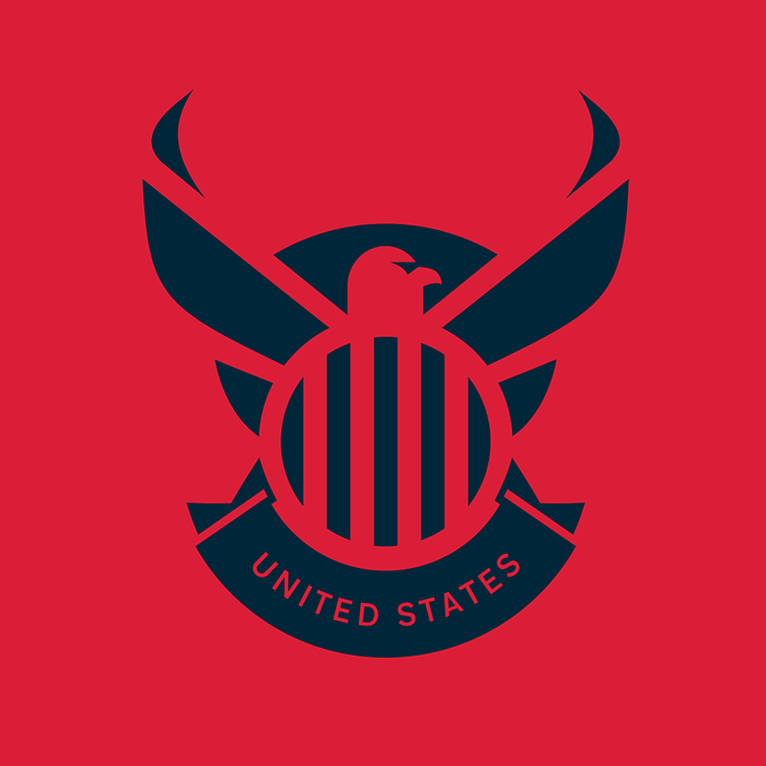
… against dark backgrounds …

… or even with some components given tonal range.

The mark adjusts gracefully to each context. We have the foundation of a system.
Next, variation. I’ve chosen two places where variation can be integrated into the system: the banner and the striped “ball.” This is where the brand will spring to life, and where you can begin to imagine just how far we can go with this system in place.
Let’s start with a basic variation. “United States” works simply and beautifully on the banner. But what if that banner space could reflect more than just that slogan? Imagine evoking a heritage feel with both color tone and banner variation:
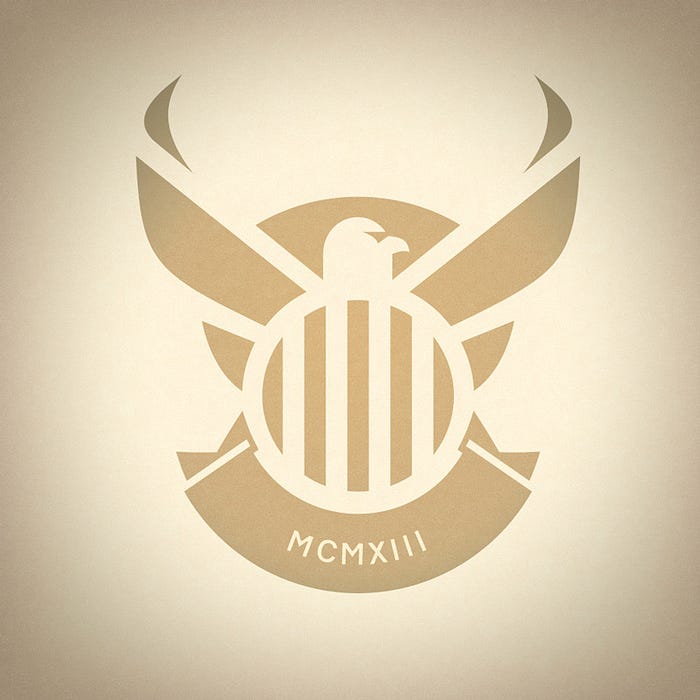
The roman numeral reference, of course, is to the founding year of the organization that would become the U.S.S.F.
Let’s take it further. If you know my work with Clean Sheet Co., you know how much we love the Gadsden motif when it’s combined with U.S. Soccer fanship. How about a Gadsden-inspired version?
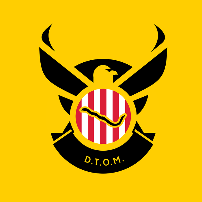
Here we see both the banner changing (to evoke the classic “Don’t Tread on Me” slogan) but also the striped ball taking on an added component. In this case, we’re referencing a common variant of the Gadsden flag, the “Don’t Tread on Me” red-and-white striped naval jack, which of course includes a snake. This flexibility — to use the inner “ball” area to reference ideas — is one of the keys to the system’s flexibility.
Let’s keep exploring this. The visage of Teddy Roosevelt (Goalsevelt?) is fast becoming a folk hero to domestic fans. How about a Rough-Riders-themed iteration?

The red and white stripes incorporate a navy sash inspired by military dress (and past U.S. uniforms), as well as tones of leathery frontier brown. The quote is a TR original, alluding to our own American code of football (albeit only a few years removed from branching away from its soccer and rugby cousins).
Further still, what if the mark inspired supporters groups to adapt it and make it theirs?
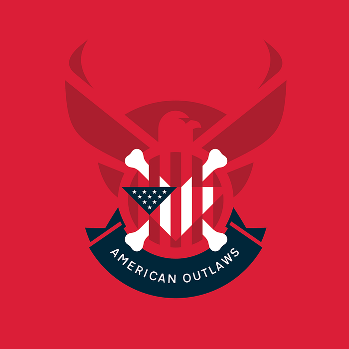
The idea isn’t to replace official logos for other organizations or causes, but to give those most passionate fans an invitation to create.
Once the system is established, creativity and expression can flourish; visual rules can be broken so long as the form is honored. Color, for one, can be highly expressive, and the striped ball can be pushed into places beyond red-and-white Americana. What if the mark could express ideas?
Perhaps a version of the mark could convey appreciation for those who serve our country:
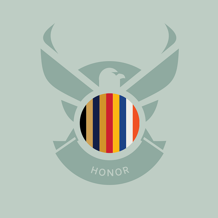
(Stripe color pairs represent combinations for the Army, Navy, Marines, Air Force and Coast Guard, respectively.)
Or, what if it could be cast as a beacon of inclusion?

Many logos have done this recently, but how many were created to support this kind of extension? This is where the branded visual expression is going.
These are just a few straightforward samples; with the right system in place, they (and many more) can spring to life, joyously.
Applications
Any visual identity system has to account for wildly different contexts. The mark is a corporate logo; it’s a marketing calling card, it’s a supporters’ talisman; it’s a uniform crest; it’s the basis of a must-have tee-shirt.
This mark can be all those things.
First, I think it would serve the U.S. Soccer establishment well.

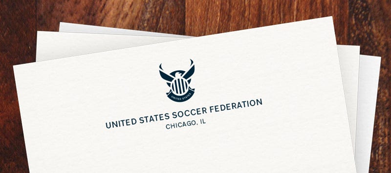
And it would lend itself to marketing in a way the current crest can’t.
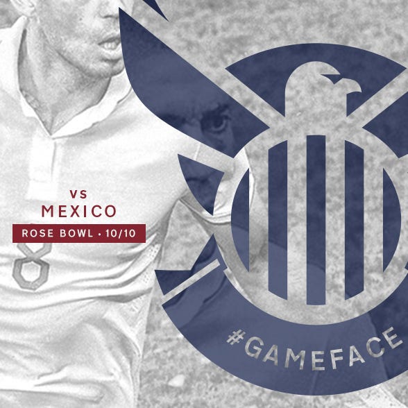
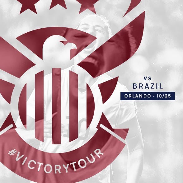
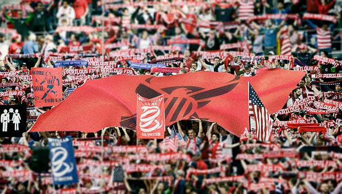
You can imagine it in the stands.
… or above the heart, on a U.S. jersey.
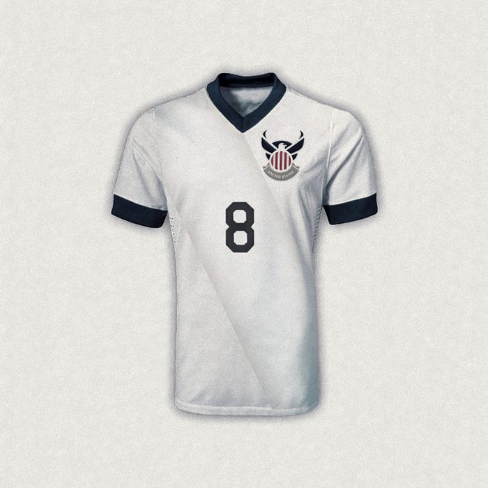
(This is just a riff on the team’s recent classic Centennial jersey template, with the mark in crest position. I think it looks pretty fantastic.)
Of course, it has to look great in the universal setting: on a beautiful, broken in, tri-blend tee-shirt.
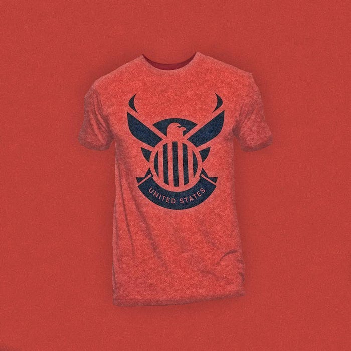
One of many, many possible tee-shirt variations. (Want one? Let me know on Twitter or via email, and I can get Clean Sheet Co. on the case. I know a guy.)
Update: Clean Sheet Co. is making this shirt a reality! You can get one here.
Oh, and did I mention it looks great with stars? The eagle is designed to hold on to them.
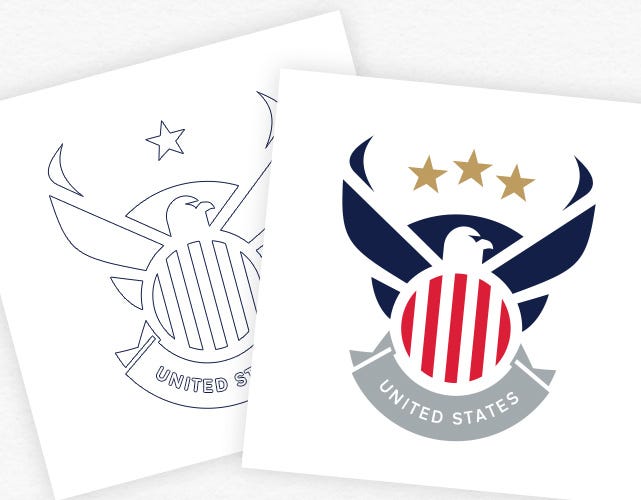
With the one star the men might win one day, and the three the women already have.
This is the visual identity I was working towards, even as I wrote that first look at U.S. Soccer years ago. It’s been a long trip, and this is where I hoped to arrive.
Update From the Author:
This piece got quite a bit of attention when I first published it, and as a result I subsequently decided to take an interesting next step: I “open sourced” the logo for anyone to freely use or adapt. The source files and more are available at peoplescrest.org (I go into more detail about the decision here).
The entire point of the piece was to suggest a way forward for US Soccer’s visual state, and I truly think these subsequent steps have helped carve out a real-world path for this design to gain traction in the US Soccer community.
This piece was written and produced, and the marks within designed, by Mark Willis, and originally published at mwillis.com.